Monday, September 27, 2010

85701 Research Based Design WEEK 8 RELATIONAL AESTHETICS

In Relational Art, the artist is no longer at the center. They are no longer the soul creator, the master, or even the celebrity. The artist instead, is the catalyst. They kick-start a question, frame a point of consideration, or highlight an everyday moment. And then, they wait. They wait for a response from the random stranger, the passer-by, the usual suspect – you and I.

No formal classes over our 2 week uni break, so I thought I would explore Relational Aesthetics, a topic introduced to us in Week 4. In one of our most engaging lectures of the semester, artist Lucas Ihlein gave us a broad overview of Relational Aesthetics and Art. Lucas’s charisma, humour and obvious passion for the subject all helped to draw a definitive picture of the meaning of Relational Aesthetics, how it can be interpreted and understood, and how it is relevant today.

Lucas Ihlein (2004, MCA)

Relational Aesthetics is an approach to fine art practice which emerged in the 1990s, first observed and definitively explored by French theorist, curator and critic Nicolas Bourriaud. Relational Aesthetics was a new definition of art – encompassing the artist, world and audience as integral to the artwork instead of judging the artwork as a singular and isolated object. Relational Aesthetics is an approach to art based in human relations and social context, artworks are interactive and connecting, in which encounters between artist, audience and engagement in the artwork can change or define the artwork itself.

Relational Aesthetics refers to artwork that is open-ended, interactive and resistant to closure. Relational Art takes place in time and space and creates interactive communicative experiences and intersubjective encounters in which meaning is elaborated collectively.   
– Legier Biederman (2006, Biederman)

While speaking with us, Lucas touched on a host of interesting examples of artworks, performances and projects in order to visually and verbally communicate the meaning and intentions of Relational Aesthetics, ranging from his own projects and work with NUCA (Network of Un-Collectable Artists) to local and international artists, historically and currently practicing.

NUCA collectable and swapable artist cards (2004, Lowe)


One of the examples I found particularly interested was San Francisco based artist Mark Horowitz, who uses humour in performance art to translate his ideas. A great example of this is one Lucas mentioned – Horowitz’s ‘Errand Feasibility Study’. Horowitz describes this project as an attempt to solve some of the common problems encountered when going about everyday activities, such as ‘loneliness and alienation, boredom, impatience, anxiety, frustration, lethargy, hunger, flatulence, humming a Neil Diamond song, encountering stinky children, head bumps, and thoughtlessness.’ (2010, Horowitz)

This was attempted in two ways, which Horowitz termed Phase I and Phase II – one: Horowitz accompanied strangers on their errands, offering advice and helping out, two: he repeated the exercise, but rode a pack mule. Horowitz documented the hilarious outcomes of his study, attracting media attention as he performed tasks such leading his mule ‘Hail’ into Wal-Mart to return a purchase.

Marc and Hail running an errand (2010, Horowitz)


Horowitz’s reknowned blog, ‘I need to stop soon’, is a treasure trove of Horowitz’s thoughts, past and current projects, ideas and oddities. Another more recent project documented on the blog (and linked flickr site) is Horowitz’s ‘Recessionator’, a scheme to solve America’s financial crisis. Horowitz, dressed in a white plastic onesy, bounces on a trampoline while his assistant sprays him with paint. He then jumps off, landing on the canvas to create artworks with his body. Horowitz then gave the paintings to banks free of charge ‘so they could sell them and use the money to bail themselves out of the fiscal crisis, thereby taking the burden off the taxpayers.’ (2010, Horowitz)


Horowitz creates original artworks using the Recessionator (2010, Horowitz)


I see this project as a hybridization between conceptual artist Yves Klein’s ‘blue’ series of work, impressions of female figures transferred to the canvas via the body, and Napoleon Dynamite.

Yves Klein's artworks, created by painting the female body then laying the body on canvas, leaving a blue impression (2008, Wunderlich)

Uber-geek Napoleon, from cult classic film 'Napoleon Dynamite'. Not only does Horowitz echo his bizarre, off-beat antics, but even bears a resemblence to him...(2010, Funny Mormans)

In other words, a hilarious play on the value and appreciation of art. Perhaps Horowitz’s artworks will actually be able to bail out America once he is dead…

Currently, Horowitz is preparing for a new project set to begin on the 1st of November. The project, titled ‘The Advice of Strangers’ is Horowitz’s idea of figuring out what to do with his life – based on the decisions of others. The public will be able to vote in real-time on-line, on every decision Marc makes for one month, from boring to serious to intimate.

The Truman Show, Marc Horowitz style. Cast your vote here.

Work like Marc Horowitz's that can be loosely clarified as Relational Art is really inspiring - I think performance is something that really has an impact, something we could utilise in the Foley St event. The idea of Relational Art is a strong undercurrent in our Grassroots concept, which is based around the Green Performer getting out into the streets and talking to people, making them aware of our concept and what they can do to help. We will also set up a blog for people to follow over the weeks leading up to Open House - Marc Horowitz's blog illustrates just how effective this method of communication is - even if you weren't there to experience the event, you can still live it vicariously.

My illustration of the Grassroots Green Performer

It is great to build/make/create installations for events like this, but with an interactive, performative element it can become something much more - an experience as well as a visual presentation.


REFERENCES

2002, Bourriaud, N., Relational Aesthetics, Les presses du réel, France

2006, Biederman, L., A Global Art World: Relational Aesthetics, New Media Arts and Biennialization, Duke University, viewed on 11/9/2010, http://lbiederm.bol.ucla.edu/Site/

2004, MCA: Museum of Contemporary Art, Artist Talk: In the Balance, MCA, viewed on 11/9/2010, http://www.mca.com.au/default.asp?page_id=14&content_id=7015

16/6/2004, Lowe, K., NUCA (Network of Un-Collectable Artists) Card Set Swap Meet – Sydney, Chaos Generation Weblog, viewed on 11/9/2010, http://www.chaosgeneration.com/2004_06_01_archives.htm

2010, Horowitz, M., I Need to Stop Soon, WordPress and Semiologic CMS, viewed on 12/9/2010, http://www.ineedtostopsoon.com/

20/10/2010, Horowitz, M., marchorowitz’s photostream, Flickr, viewed on 12/9/2010, http://www.flickr.com/photos/marchorowitz/

23/1/2008, Wunderlich, Forum: drawing tutorials, link to some helpful tutorials, The Carving Path, IP. Board, viewed on 12/9/2010, http://www.thecarvingpath.net/forum/index.php?showtopic=1282

2010, Funny Mormans, Napoleon Dynamite, WordPress, viewed on 12/9/2010, http://funnymormons.com/2010/09/napoleon-dynamite/

2010, Horowitz, M., The Advice of Strangers, Creativetime, viewed on 12/9/2010, http://www.theadviceofstrangers.com/

Monday, September 20, 2010

85701 Research Based Design WEEK 7 GRASSROOTS

Over the course of the past few weeks, my group and I have put some careful consideration into the development, planning and execution of our idea. Newly entitled ‘Grassroots’, the name and purpose of our project signify not only our intention of championing the return of nature to the city, but also the involvement and power of the community in supporting and building initiatives such as this one from the ground up.

Reflecting on the idea of ‘doing the maximum with the minimum’, we focussed on executing simple and powerful ideas rather than overly complex ones to make the greatest impact. For this reason, we are using two simple concepts in concert which together work to promote and showcase our concept clearly and succinctly: consisting of an installation project on the night as well as an interactive performance.


GRASSROOTS: A BREAKDOWN

The installation aspect of the concept will be a canopy of greenery, created by living plants suspended from helium balloons trapped in nets above the laneway. Hopefully this canopy will be lush and evocative, describing the beauty of nature. This canopy installation, however beautiful, will really play more of a supporting and mainly aesthetic role in conveying the concept of Grassroots. The key idea we intend to use is the performative one, which evolves over the course of the preceding weeks to the event as well as on the actual night.

A personality, probably a member of our group, will be dressed in a costume completely covered in greenery and flowers, creating an over-the-top look which is obviously meant to make a statement. Before the situation takes place in Week 14, we will document the performer walking through various areas in the streets surrounding Foley, handing out flowers and quirky cards, generating interest in the project and discussing nature in the city.

Proposed scenario for the Green Performer to engage in.


On the night of the event, the performer will also be dressed-up and circulating through the crowd, acting as the voice of nature in the city – interactively making people aware of our ideas verbally, visually and demonstrably by engaging people who turn up to the event in discussion and handing out balloons, seedlings and a link to our Flicka site (where we will display all the photography documenting the performer’s activity before and during the event). The actions of the Performer leading up to the night act as an important publicity stunt for Open House and establish our concept, and the documentation of our photography presented on our Flicka site will enable the concept and event to live on.


Conceptual sketch of Foley St on the night of the event (by Janet and I)
Technicalities of the canopy installation and suspension (developed by Janet)

When looking back at the process and development of our concept from seed to fruition, it is interesting to examine the effect of the theories and ideas we have been exposed to over the course of the semester to date. While not actively trying to develop ideas in accordance with any one theory, I think we have subconsciously taken on board information – particularly regarding the S.I.’s approach to play in the city and the interactivity of Relational Aesthetics, and have allowed them to help direct our project’s development.

Sunday, September 12, 2010

85701 Research Based Design WEEK 6 THE SITUATIONIST INTERNATIONAL

I haven't tackled the topic of the Situationists until now, but after having a second lecture with Sam Spurr, I think it is time to discuss them. When the topic was first introduced I thought the Situationist International was a bit stupid, and I couldn't see the ramifications of their ideas at all. I think I needed these weeks to really understand the Situationalist movement and to soak up their attitude and effect on today's world, and come to an appreciation of their goals and how their thinking has affected architecture and the city.


A bit of background on the S.I.:

Led by theoretical thinker Guy Debord, the situationist international was an amalgamation of other groups and thinkers, a hybrid, multifaceted machine consisting of a wide variety of people, cultures and disciplines. The movement was fueled by a blend of Marxist and Avant Garde ideas from the early twentieth century, whose participants felt life had become banal under capitalistic conditions, dictating desires that were not their own.

The four key groups that formed the basis of the situationist international were: the London Psychogeographic Society, headed by Ralph Rumry, the Imaginist Bauhaus group, the Letterist International – experiments with language and culture, and Cobra, a group of abstract painters.

The situationist international was a creative movement, but refused to be branded as such – instead wanting to transcend and move past art. They wanted to eradicate art as it was then known, instead created a new, more modern kind of art that would be an interactive part of life rather than a reflection or expression of it. To me, it seems quite ironic that one of the most famous products of the movement was a piece of art – the painting ‘Depassement de l’art’, proclaiming the death of art.

The situationists were concerned with expressing their desires and the desires of the city, embracing play and rejecting work, creating ‘situations’ in which one could engage with the city as flux – an ever changing event.
Embracing this idea of ‘all things as play’, the situationists created a sort of game to explore the city – the ‘derive’, drift. In some ways very much like ‘flanerie’, the derive involved actively engaging in random travel through the city, letting the environment dictate your passage, letting oneself be carried toward ‘units of ambience’, where colours, sounds and chance meetings determined movement. 


Rethinking the city spaces: a Situationist International 'derive' map (Photocartographies, 2009)
My 'derive' map, showing our passage across the city from UTS to Foley St

While seemingly engaging in the same activity as the flanuer, a derive is actually quite different. The concept of the derive strikes me as an activity in disorientation, making abstract connections between random points, exploring the flux of time and space and re-amalgamating the best of the city. Underlying the physical experience are psychogeographical ideas – how spaces can determine psychological and emotional states, impacting the mind and senses. On the other hand, the flanuer seeks merely to experience the city, absorbing the surroundings in a particular area and taking in the overlooked aspects of the city, rather than disorientating, abstracting and rearranging the city into a utopian metropolis.

It is an interesting way of viewing our interactions with our environment and world - seeing it not as a static place that is, but a changing place that can become anything we make of it. The idea is rather whimsical, even if problematic in practice.


REFERENCES

Information from Lecture given by Shane Hazeman, week 2.

Information from Lecture given by Sam Spurr, week 6.

2005, Simon, F., The Situationist International: A User's Guide, Black Dog, London

2009, Photocartographies, Photocartographies, Los Angeles, viewed on 15/8/2010, http://www.tatteredfragments.info/category/all/events/

Monday, September 6, 2010

85701 Research Based Design WEEK 5 'PICK ME!'

This week was one of intensive brainstorming for a potential situation to occur in Foley St, Darlinghurst. When beginning brainstorming for the Foley St event, ideas were coming thick and fast, thoughts were proposed, tossed around between the five of us – easily embraced and easily discarded. We decided we needed some clarity in our idea development, and the best way to achieve that would be to conduct some more in-depth research into the Foley St area.

Meeting in the wee hours (those 8.30am awakenings are a killer) we retraced our steps from UTS to Foley St, then spent some time wandering about the area, heading down interesting laneways or following our senses to curious details in the urban environment – a kind of flanerie of the area, expanding our senses to absorb the feeling of the place and take note of overlooked details, as well as the kind of people as well and volume of people around at the time, the type of businesses and the overall atmosphere.

While wandering, I was struck with the relaxed feeling of the other laneways around the Foley St area, which were not actually dead and deserted but filled with vibrant detail – small street art pieces and artistic graffiti splashed across the brickwork added character to the space, as did quirky stickers and tags, but most surprising was the proliferation of greenery. Above all – the elegance of tufts of plant life penetrating the cracks of mortar and claiming their rightful place in the urban streetscape.


In many lanes, pot plants and gardens bloomed, and we were awed when we came across a small residency on a lane completely overgrown with vines and greenery across the façade, inspiring us to touch and appreciate. The insurgence of nature also extended into small weeds and plants popping seemingly out of nowhere, growing admist a concrete jungle.


Lush greenery enveloping the facade of a laneway residence

This visual journey through the area has proved very fruitful in stimulating ideas for potential situations, and as we discussed afterward, we were all drawn towards ideas revolving around nature and the city – bring back nature and greenery, promoting growth – much as we would like to take an empty, dead lane like Foley and see it bloom anew.

Discussing our observational and sensory finding in the charming Commons eatery afterward, we all agreed that the presence of nature in the laneways surrounding Foley was something that really impacted, and would be a great basis for a concept strongly based in the area and relevant to the Foley St endeavor – the return of nature to urban spaces.

We also had an enlightening discussion with the owner of the Commons, who came from a background of landscape architecture and sustainability himself and whole-heartedly supported our aims, giving us some helpful pointers and advice: ‘It’s about doing the maximum with the minimum.’


With a firm handle on our primary research and burgeoning concept, we next turned to secondary sources to find further inspiration and generate new ideas. One installation art example we looked at was ‘Head Gardeners’, a series of guerilla artworks by Anna Garforth in London. These artworks consisted of recycled plastic containers painted with playful, comical expressions, which acted as vessels for a range of living plant life. This work was displayed in accessible locations around London streets, emphasizing the message about bringing the role of nature within the city structure to attention.

'Head Gardeners' (The Instablogs Network, 2010)

'Head Gardeners' (The Instablogs Network, 2010)


Anna Garforth has also worked on other collaborative street art projects which the same theme, such as ‘Rethink’ and ‘Nourish’, which are graffiti-style words created on a large scale using materials like leaves and moss. These words are statements, aimed at changing attitudes about the environment and forcing viewers to analyse modern consumer behavior.

'Rethink', created with leaves stapled to the fence (designboom, 2010)

'Nourish'; ecological graffiti, created from moss in collaboration with Eleanor Stevens (designboom, 2010)


REFERENCE LIST

Justa, A., 2010, Anna Garforth promotes green with thought provoking eco-graffiti, The Instablogs Network, viewed on 5/9/2010, http://www.greendiary.com/entry/anna-garforth-promotes-green-with-thought-provoking-eco-graffiti/

2010, Anna Garforth, designboom, viewed on 5/9/2010, http://www.designboom.com/weblog/cat/8/view/10993/anna-garforth.html

Friday, September 3, 2010

85701 Research Based Design WEEK 4 CREATIVE CITIES

The concept of ‘Creative Cities’ first emerged in the late 1980s, purported by theorist Richard Florida. Florida proposed that cities with a statistically high population percentage of the ‘Creative Class’; a group Florida defines as including homosexuals, artists, musicians and others using creativity and intellectual engagement in the workplace – were more likely to flourish and develop economically, due to the more tolerant, safer and more attractive environment generated by the Creative Class.

(2010, British Council)

Florida founded the Creative Cities concept on the assumption that in terms of city development and growth – work and livelihood would follow the Creative Class, growing up and expanding around an artistic hub. This idea opposes traditional understanding of the development of cities, where generally a population will grow in direct response to the available work in the area, where the paths and locations of people are drawn by work.

Florida’s Creative Cities theory is a problematic one, and has suffered not inconsiderable critique since its emergence. Many critiques describe Florida’s theories as elitist and exclusionary, and his data and statistic test have been questioned – according to Florida’s prerequisites, San Francisco has a very high creative city index due to the high percentage of gay population, yet the city performs more poorly in economic terms than various other, decidedly non-creative cities such as Houston.

Even though the idea of Creative Cities may be flawed, when pared down to its most basic it is essentially a passive approach to embracing creativity and community within the city, which has had some impact on design. Planners now consider not only the structure they are building, but also consider designing the community surrounding the structure and how interaction can be achieved. A great example of this is the Central Park project in Chippendale. This project is a designed ‘urban village’, encompassing structures for commercial and residential use surrounding a spacious park.


Conceptual draft for Central Park (2010, Fraser Property )

‘With 11 buildings, 1,800 apartments and a lively collection of shops, cafes, restaurants, laneways, terraces and offices, Central Park transforms the old Kent Brewery in Chippendale into an intelligent interplay of buildings and public spaces, and raises the benchmark for sustainable living globally.’ (Frasers Property, 2010)

Location of Central Park in downtown Sydney, Chippendale (2010Fraser Property )

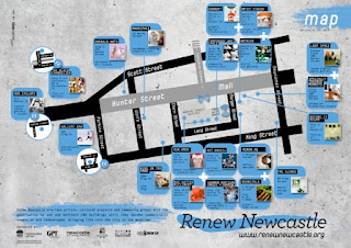
Another example of the Creative Cities concept used in direct application to city infrastructure is the Renew Newcastle effort, which aims to utilize vacant space in the CBD district. After the closure of Newcastle’s BHP steel industry, the commercial centre of the city began to decline, leaving large amounts of empty space in the city. Renew Newcastle involves hiring out this free space inexpensively for creative endeavors, such as galleries and studios, which will encourage growth and repair in a deteriorating city.


Map of Renew Newcastle projects and sites (2010, Inventive Labs)

(2010, Inventive Labs)


REFERENCE LIST

2005, Florida, R., Cities and the Creative Class, Routledge, New York

11/10/2010, Florida, R., Creative Class: The Source on How We Live, Work and Play, The Creative Class Group, viewed on 2/9/2010, http://www.creativeclass.com/

2006, Florida, R., The Rise of the Creative Class, The Washington Monthly, Washington DC, viewed on 2/9/2010, http://www.washingtonmonthly.com/features/2001/0205.florida.html

4/1/2010, Macgillis, A., The Ruse of the Creative Class, The American Prospect Inc., viewed on 2/9/2010, http://www.prospect.org/cs/articles?article=the_ruse_of_the_creative_class

2010, Shaping Creative Cities in the UK and East Asia, British Council, viewed on 3/9/2010, http://www.creativecities.org.uk/tag/bangkok/

2010, Frasers Property, Central Park, Frost, viewed on 3/9/2010, http://www.centralparksydney.com/

2010, Reeders, N., Renew Newcastle, Inventive Labs, viewed on 3/9/2010, http://renewnewcastle.org/